Reflections on Multimedia Learning Principles
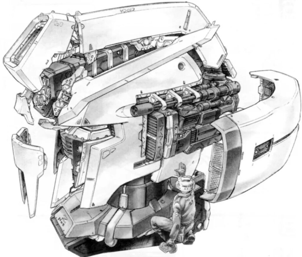
One principle that felt most intuitive to me is Segmenting. The article’s hand diagram example was very clear even though I have never taken anatomy—it broke the information into steps I could easily follow. Personally, I enjoy mechanical-themed content, and in some Japanese anime the creators show exploded diagrams of machines. The image below is from the Japanese anime Gundam, showing a mecha design blueprint that makes it easier to see and understand the internal structure and layout of the head unit. Real engineers use the same method in blueprints to guide workers, and I see how this approach is also valuable for learning.
What surprised me most was the Image Principle. Since the pandemic, many online classes include instructors showing their faces on screen. For me and my friends, this never made much difference in learning outcomes. If anything, it just made the teacher seem more serious about the class. In regular in-person settings, we can already see the instructor, so I didn’t expect this to matter.
For my comic project, I hope to apply most of the principles, but some will be easier than others. Signaling, Contiguity, and Personalization seem straightforward to use in a comic format. However, Modality and Pretraining feel more challenging. Comics are silent, so I can only combine text and images, and the 12–20 panel limit makes it difficult to include much pretraining. My target audience will likely be ages 16–35, so I plan to keep the style young and engaging.
Finally, I realized I had often used Modality in past presentations by simplifying slides and focusing on narration, though this is harder to translate into comics. The new concept for me was Germane Cognitive Load. I see it as something we often build unconsciously through experience, but now I want to remind myself to apply it more intentionally in future learning and design.
Thank you for your time.